A Serie about Cost-Saving Tips for Design System Developers

Does it even make sense to write blog posts in the AI era? With few notes some common AI tool can generate pages of excellently written text using the purest Cambridge English. Such tool was used to help me to tune even these lines.
However, what AI still cannot do is to transfer experience. And that is what you will find in this blog post.
I’ve been working on UI component libraries and design systems for more than 5 years now and after completing my most recent project, I decided to write few useful tips for anybody, especially developers, who may find themselves struggling with common design system challenges, or, like myself, frontend development efficiency challenges.
Episode 1: Talk to the Decision-Makers
The efficiency challenges that my previous organization faced were:
- requirements on costly pixel-perfect look & feel early on
- uncertainty whether the end users will actually appreciate the pixel-perfect frontend in a way that would reflect in the company’s revenue
- disregarding the value (look & feel and behavior) of the underlying 3rd party UI component library (Angular Material) and constant requests to override it
These requirements were mostly coming from the business and design departments. Even though we were using Angular Material, the business and design were never quite satisfied with the look & feel and the features of the components this library was providing; they wanted buttons smaller, text bolder, colors a few shades different — you name it.
Design system or even a simple UI component library is supposed to improve efficiency. That’s where we, as part of the design system / UI component library team come in. We’re here to keep things efficient and sensible.
Therefore, the first lesson I’ve learned is how and who to speak to when you feel your organization may be using its resources ineffectively on unnecessary frontend development and maintenance.
So, what can we do to save our organization some money?
First off, let’s talk about these issues early enough with the decision-makers — the folks who hold the purse strings.
What we need to do is to show the decision-makers some hard numbers and ask if all that initial look & feel tinkering is really worth it in the end. The hard numbers part — that is sometimes the hardest part. Only tool we’ll have in our hands is our ability to estimate.
How to estimate CSS overrides?
What I’ve learned is that every line of CSS overriding styles in the underlying UI component library, although it may seem like a simple task, is actually quite expensive. To understand why, we must consider that:
- You must figure out what exact style of what exact element inside a component is different in the design from your designer than in the library. This often involves lengthy discussions with them, lasting several minutes.
- Then you must find the place in that UI component library where the style rule is written. That includes searching in the files in the repository of your UI component library and studying its CSS.
- Then you must write stronger selector.
- Then you must rethink and refactor everything in order to write as optimal, clean, readable, changeable CSS as possible.
A good rule of thumb is to allocate at least one hour of estimated time for each style or line of overridden CSS code.
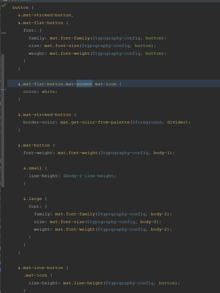
If this still sounds like too much, we can go back to my previous project, where the design department was not satisfied with the look & feel even of the simplest component — the button.
They required to change internal paddings, font size, line height, background color shade (even though it was still red, but they wanted different red), the hover effect visualization opacity, the focus state background color shade…in the end, it was still a button, but with 200 lines of overriding CSS!
Estimate a minimum of one hour for each style or line of overridden CSS code.
It took us several full days of work initially, and we also had to dedicate additional time to maintaining the overridden CSS over the next phasis of the project.

Additional costs of CSS overriding — do the users actually need it?
The method of CSS customization we demonstrated isn’t just expensive and unproven in its value to users, but it’s also risky.
First off, the styling of the underlying UI component library could change at any time. Developers of the library might alter CSS class names, style properties, or even the entire internal DOM structure of the components.
This means that every library upgrade puts our custom styles at risk of becoming obsolete.

Secondly, we’re uncertain whether end users will be willing to pay for any developed feature, not just those involving CSS overriding. To gain insight into this, we must do research, prototyping, usability testing, and later analyze the gathered user data, opinions, and responses. Based on this analysis, we’ll make decisions on further development. However, this is a whole other topic that extends beyond the scope of this blog post.
What are typical business-design-development dynamics?
The problem is that in our daily work within our teams, sometimes we butt heads for too long with our analysts and designers. Especially when even after weeks or months of trying, there is no significant change in the mindset and requirements for overriding underlying UI component library still appear in the sprints.
I used to hear from analysts and designers that Angular Material does not fulfil our needs and looks too much like a Google product (well, it is a Google product).
I used to tell them that we should prioritize completing a version of the application using the Angular Material as it was, and focus rather on the functionality our end users require and are willing to pay for, before achieving pixel-perfection.
Don’t take me wrong, usually the analysts and designers intentions are noble, driven by a desire to please and fulfill organization goals. However, sometimes they’re shooting for the moon without considering the costs. Chasing pixel-perfect designs ends up costing a fortune and slowing things down. And sometimes the upper management or even CEO themselves do not consider the costs, which is contraindicative to our goal to save (and earn!) some funds on unimportant frontend development.
To emphasize the advice earlier, what we have to do in order to help our organization is stand up, arrange a meeting with the relevant decision-maker, and discuss the inefficiencies we’ve identified, along with suggestions for improvement. Do what we can to agree on limiting the excessive demands for changes to the underlying UI component library’s look and feel.
What would I advice to my a bit younger self?
Maybe you ask now: did this guy really not know such an obvious truth? I agree. It does sound obvious. But despite knowing this, I kept on writing code and discussing the issues within my team, but didn’t take any further action.
What I could do better instead of focusing on my role as a developer was embracing more my role as a consultant. Just imagine if I had expressed my doubts to the right person earlier. I actually did that after my project ended… and the they were receptive to my ideas and took my concerns about inefficient development seriously. Particularly when I demonstrated the considerable funds we had squandered in this manner.
Therefore, this blog post is aimed to encourage people to actually make the difference in their project and enable their team and product to success (for example applying advices from this blog post).
This time I had been just too much of a developer and too little of an innovation enabler.
Key takeaways
- Avoid prolonged debates with analysts and designers regarding the customization of underlying UI component library.
- Speak directly with decision-makers and illustrate the financial consequences of overriding components.
- Acknowledge that every line of overridden CSS code demands at least one hour of work.
What’s next?
In the next episode, we’ll tackle risk management. What if, even after laying out the costs of tweaking UI components and chasing pixel-perfection, even the CEO insists that look & feel take precedence? This puts the project in danger, as our custom overriding CSS is vulnerable to upgrades of underlying UI components library. As design system developers, we need to find ways to handle it.
But, before we dive into that, learn from my mistake and take action now: make sure to schedule that meeting with the right person to save your organization some cash!
“It’s just one line in CSS” is how organizations bleed their money was originally published in ableneo Technology on Medium, where people are continuing the conversation by highlighting and responding to this story.
