Theming guidelines — Part 6 —React defaultProps Example
The previous article was about explaining why you should use components in defaultProps, now we try to create one as an example.
Improve how you style React apps — Use components in defaultProps

Build a simple week calendar
Let’s assume we have a task to create a calendar that will display day names in header and boxes with actual appointments below.
Everything should start with a sketch
The minimal representation would be a bunch of headers and some other elements under each header.

Example — Part #1
- Start with opening https://codesandbox.io/
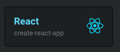
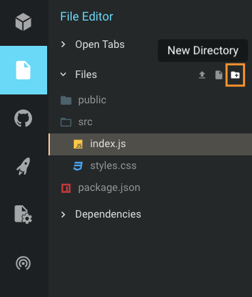
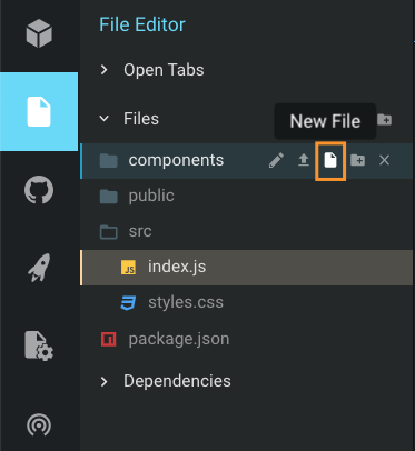
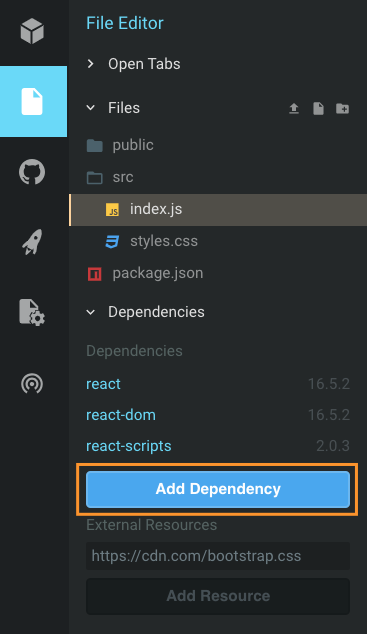
- install new dependencies
@emotion/core
@emotion/styled
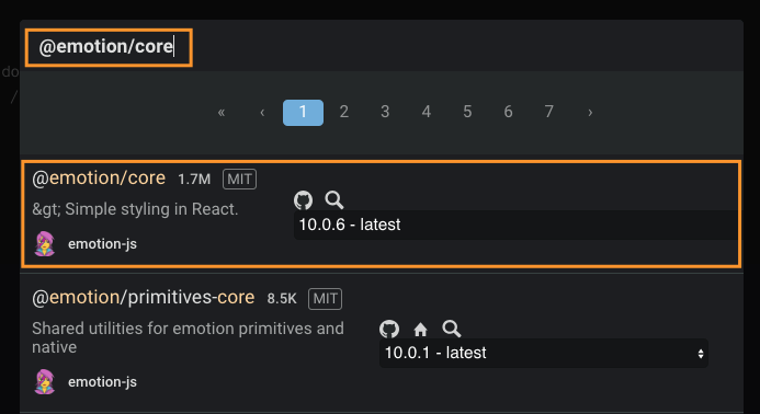
- add the following content to the Calendar.js file
import React from "react";
import styled from "@emotion/styled";
import { css } from "@emotion/core";
const Calendar = ({ children, ...props }) => children(props);
Calendar.defaultProps = {
  children: () => <h1>Calendar</h1>
};
export default Calendar;
- click on change on Current Model View
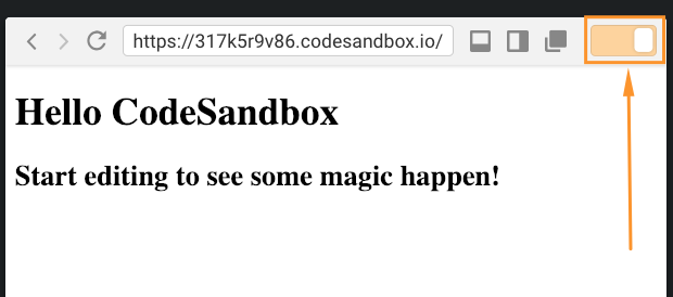
- now you are presented with a component using render props
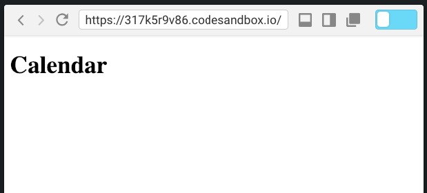
Example — Part #2
From the sketch you can see components you will need
- Wrapper of the whole component
- Column that includes Header and other Box-es with line Item-s
- Create components
- Add created components into children function
children: ({ Wrapper, Column, Box, Item, headers }) => (...)
- create a skeleton from newly created components
- Change index.js to use Calendar component
- Copy the children part for Calendar.defaultProps and past it to index.js
Now you have a skeleton in components/Calendar.js and its implementation in index.js.
Result
Example — Part #3
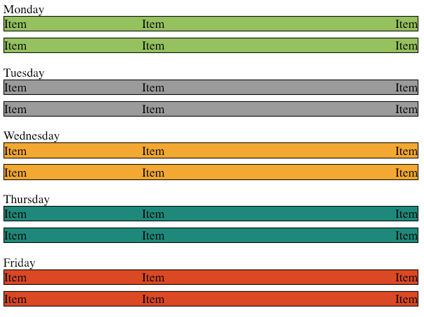
- Style components, add border and background colors for Item
- Add some responsivity
- Finish the look to something like this. (you can use only one color)

Example — Part #4
- create some example data to display
- try to change index.js to render a calendar with the example data
Result example implementation with more than can be covered
A full article explaining components in defaultProps
Improve how you style React apps — Use components in defaultProps
👏Clap, 👂follow for more awesome 💟#Javascript, ⚛️ #React content.
Example of a component with styled components in defaultProps was originally published in ableneo Technology on Medium, where people are continuing the conversation by highlighting and responding to this story.
